
2024
2025
MGIMO Digital ESG Library
A digital academic ESG library for MGIMO University.
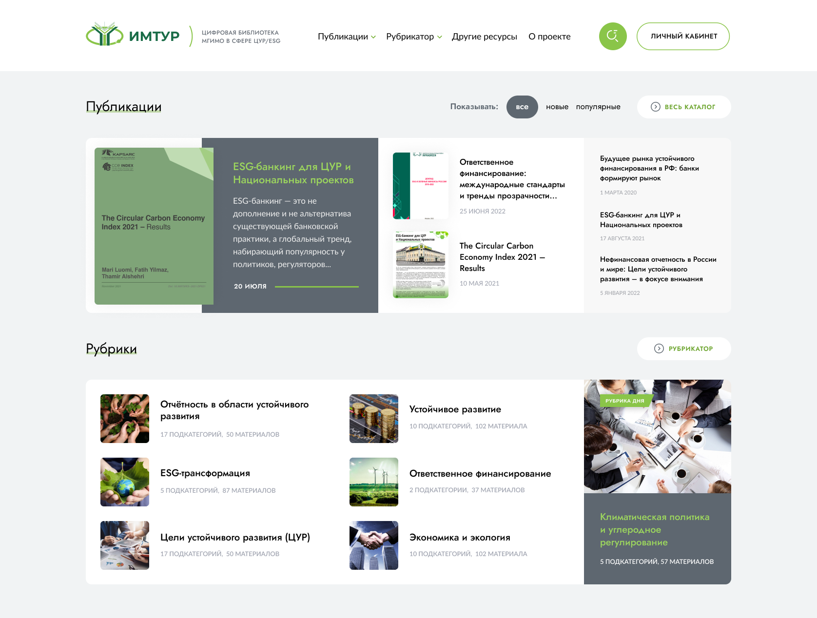
Before this project existed, MGIMO’s ESG materials (Environmental, Social, Governance) were scattered across five separate sources: a physical library, the university website, external drives, paper publications, and informal student networks. There was no unified access system: obtaining restricted materials required personal requests to faculty or the dean’s office, with approval taking days to a week. No search, no filtering, no permissions hierarchy. MGIMO is one of Russia’s most prestigious universities, with 8,600+ students and 1,200+ faculty.


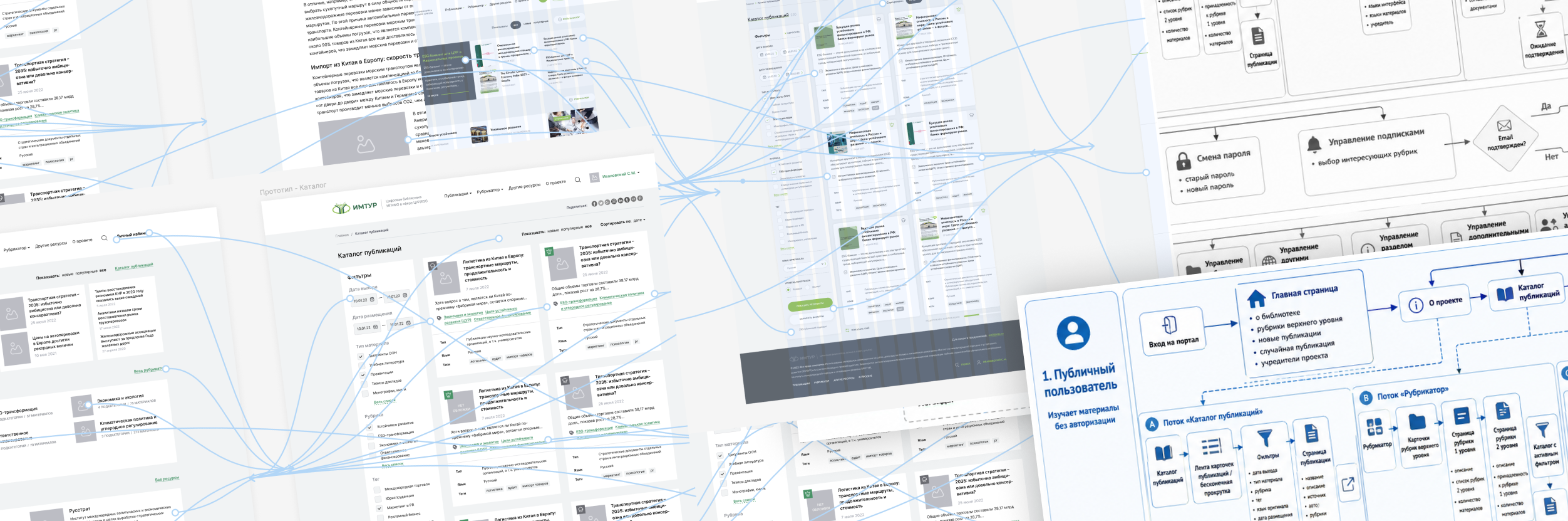
There was no unified system — just a collection of disconnected sources, informal permission chains, and no digital infrastructure for working with academic content at scale. Materials on ESG (Environmental, Social, Governance) and sustainable development existed in five separate places simultaneously, with no common access logic and no way to search across them. Students depended on faculty to unlock content. Faculty had no tools to manage what they shared or track who had access. The institutional overhead wasn’t a side effect, it was the only system that existed.
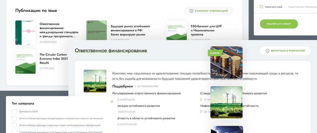
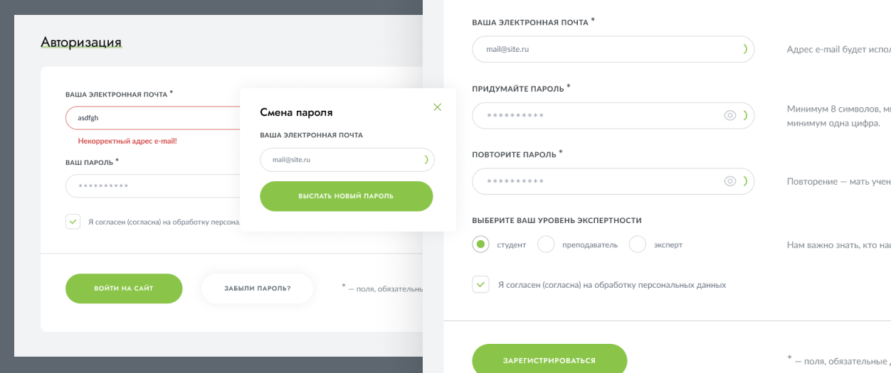
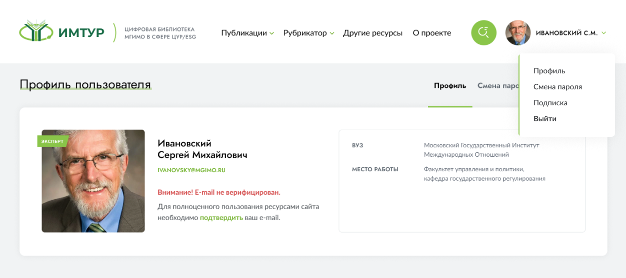
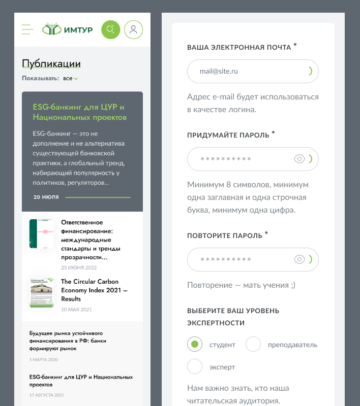
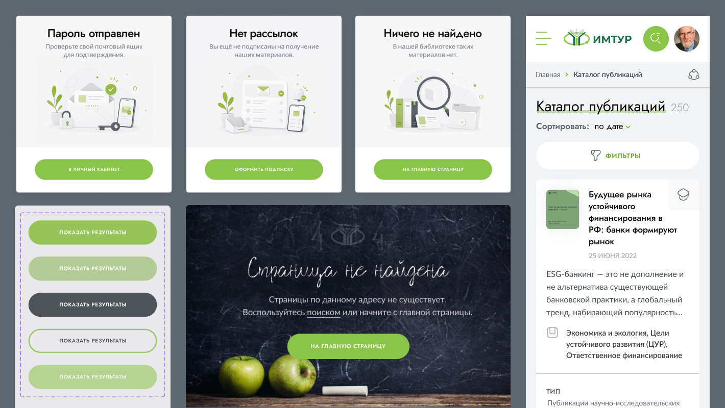
My task was to design a platform that replaced all of that: a single structured resource with a logical rubricator, precise multi-parameter filtering, role-based access that removes the need for manual approval entirely, and personal tools that give each type of user continuity across sessions. The goal wasn’t just to digitize existing content, it was to make knowledge genuinely reachable, for the first time, without asking anyone’s permission.
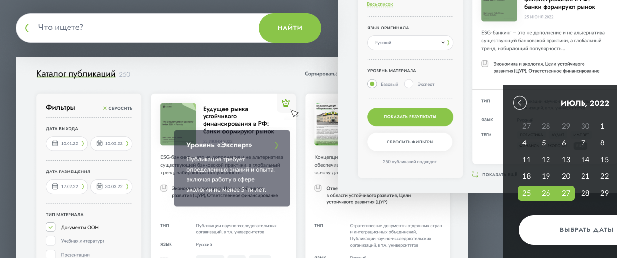
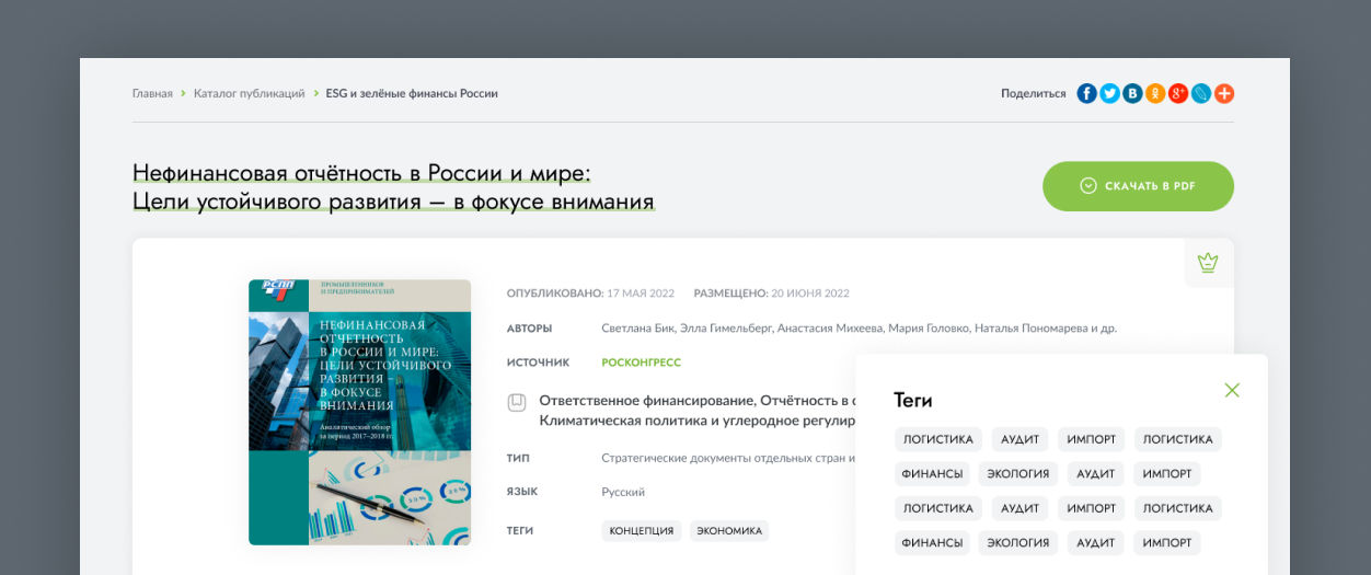
Searching for the right academic material is rarely a simple task, especially when the subject domain spans multiple disciplines and the audience ranges from first-year students to senior researchers. Throughout this project, the central design question was: how do you make a large, complex body of knowledge feel navigable without oversimplifying it?
The highlights below reflect some key decisions where that tension was most deliberately resolved.

Working with Alex was genuinely easy and enjoyable. At the start, we had a huge amount of scattered, chaotic information. Alex managed to structure it all, turn it into something clear and user-friendly, and bring real order to the product. Now it looks like a proper system and works like an intuitive mechanism: the flows are simple, the screens feel modern and clean, and nothing gets in the way of the user. Great communication, always responsive, and we’re truly happy with the result.