Back to works
2024
2025
onlineradiohub.ru
web
media
redesign

Online Radio Hub

A UX redesign of an online radio catalog: fixing broken navigation, hidden search, and a feature gap that was costing the platform its users.
Online Radio Hub

Online Radio Hub is a catalog of 15,000+ radio stations from around the world. The platform had real content and real demand, but was losing users: navigation was confusing, search was invisible to more than half of visitors, genre tags were disorganized, and the feature set lagged behind competitors. Most users left before ever reaching a station page or pressing play. The task was to fix what was broken, restructure what was confusing, and add the features users actually wanted: a volume control, daily playlist, song charts, favorites, and an interactive map.

Role
Role
UX/UI Designer, UX Writer, User Experience Researcher
Team
Team
Project Manager, Frontend and Backend Developers
Timeline
Timeline
3 months for UX, research and final UI mockups
Project scope
  • Market & audience research: analysis of the online radio streaming segment, user behavior patterns, and competitor feature sets.
  • Competitive audit: review of comparable platforms to identify navigation patterns, feature gaps, and retention mechanics worth adopting.
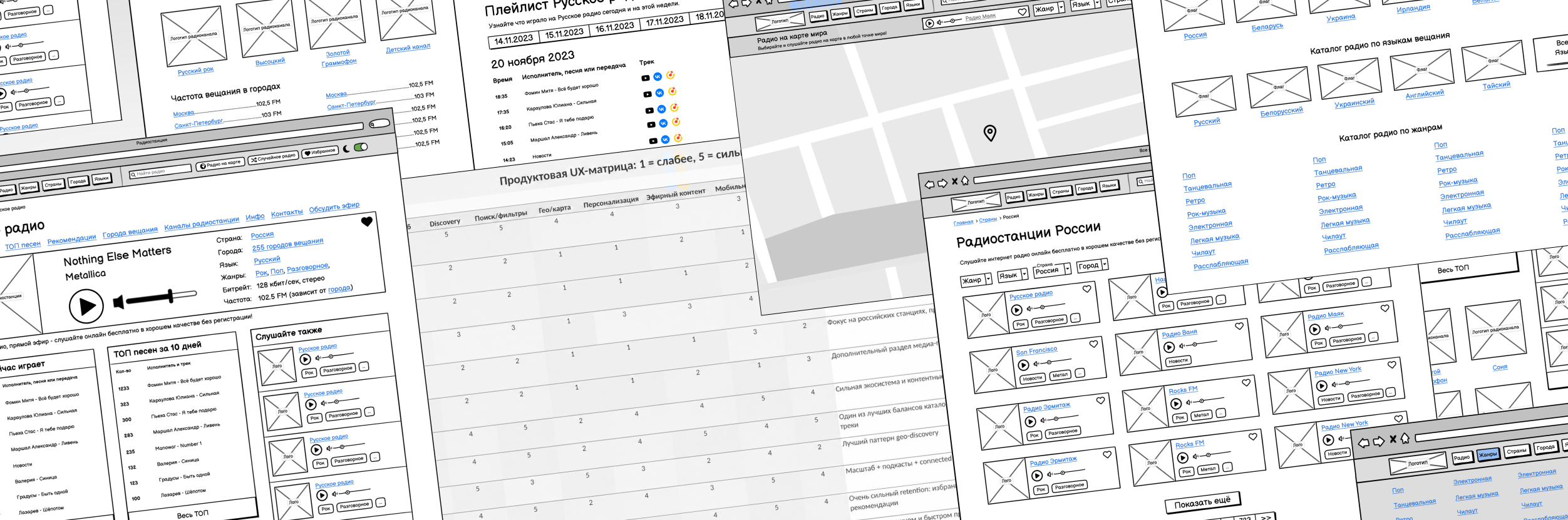
  • UX audit: assessment of the existing interface, identification of drop-off points, navigation failures, and search visibility issues.
  • UX writing: interface copy development: labels, hints, empty states, onboarding prompts.
  • UI design: full visual system across desktop (1440px), tablet (768px), and mobile (360px).
  • Figma component library: reusable components, auto-layouts, variants, and developer handoff documentation.
Key achievements
×2,3
Retention rate growth: the share of users returning three or more times within 30 days, compared to the previous version.
×3,1
Increase in sessions starting from the Favorites section: showing that users are now building habits around the product, not just visiting once.
–56%
Time from landing to audio playback: users reach the station and press play significantly faster than before.
+40%
Favorite Add Rate: the share of users adding at least one station to favorites (after the redesign).
+38%
Filter-to-Play Conversion: more users who engage with filters go on to actually play a station.
Task

The platform had an audience problem disguised as a design problem. Search was invisible to 58% of users: a small, unmarked button placed where almost no one looked. Navigation had no clear logic, genre tags were scattered with no structure. Users arrived, took a look around, got confused, and left (often without ever listening to a single station).

My task was to redesign the core experience: surface the search and filters where users actually look, rebuild the genre system into something navigable, and add the features that had been missing from day one. The goal wasn’t a visual refresh, it was a functional fix that addressed real behavior problems with results you can actually measure.

Goals
  • Fix the search and filter visibility problem that was blocking more than half of users from finding stations.
  • Restructure the genre system into a navigable, browsable catalog rather than a disorganized tag list.
  • Reduce the time from landing to audio playback: make starting to listen as fast as possible.
  • Add the features users were missing: volume control, daily playlist, song charts, favorites, and an interactive map.
  • Build a product worth returning to, not just visiting once.
Process highlights

Finding the right radio station should feel effortless: you know what mood you’re in, and the interface should get out of the way. The redesign focused on making discovery fast, navigation obvious, and the listening experience worth returning to. The highlights below reflect the decisions that had the most direct impact on user behavior.

Online Radio Hub
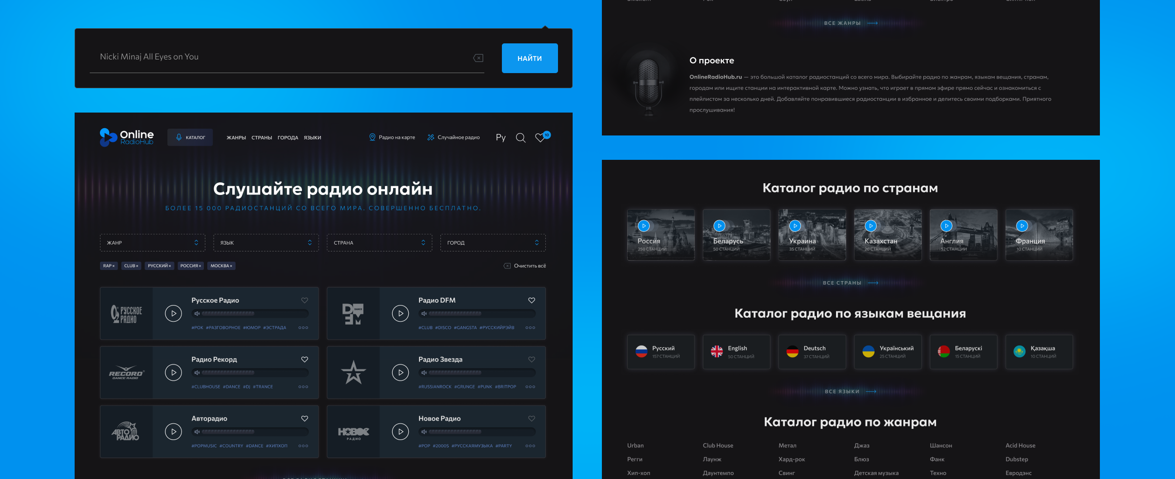
Search moved where users actually look
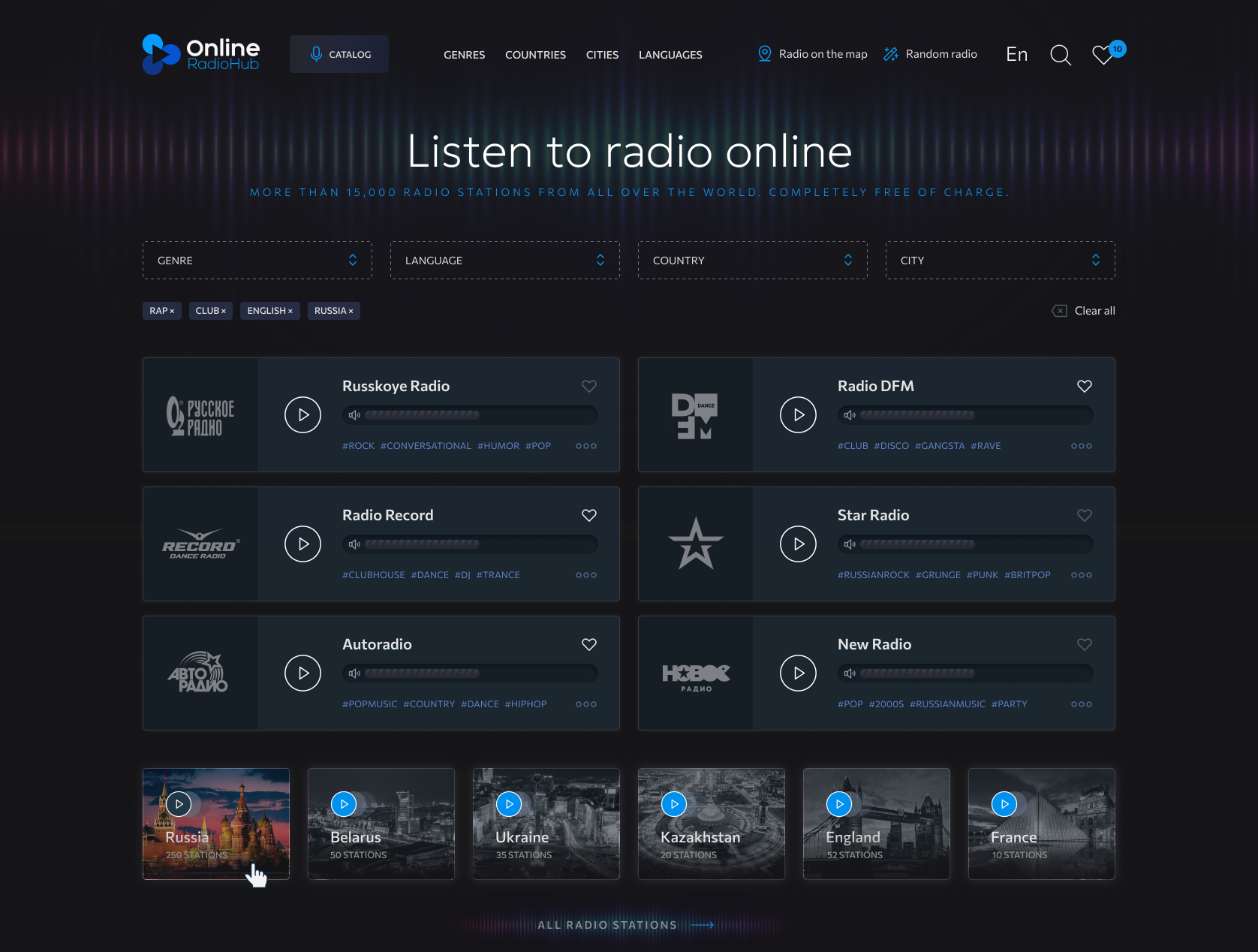
The station search and filter panel were redesigned and repositioned to the top of the page: visible immediately on load, no hunting required.
Genre system rebuilt from scratch
Tags were reorganized into a structured, browsable genre catalog, replacing a chaotic list with a navigable system users can actually explore.
Three discovery paths in one view
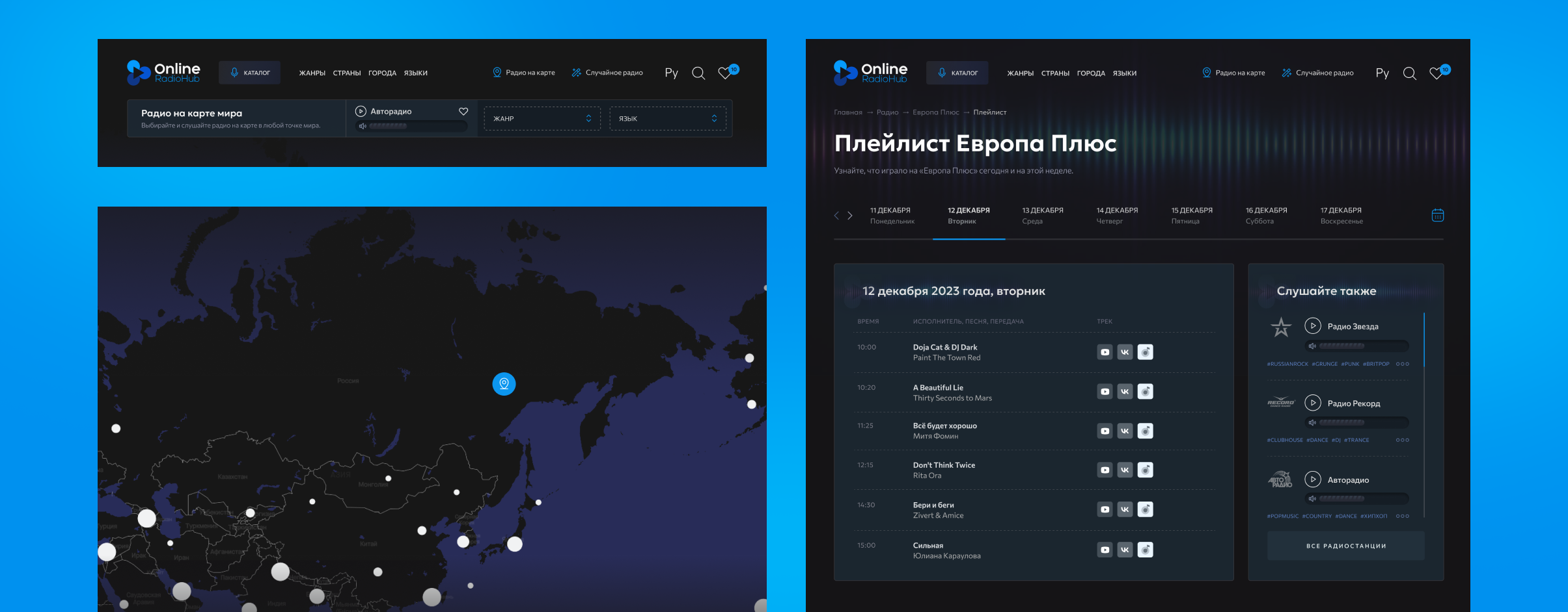
Genre, country, city, and language filters sit alongside the interactive map and random station feature, giving users multiple ways to start listening from a single screen.
Online Radio Hub
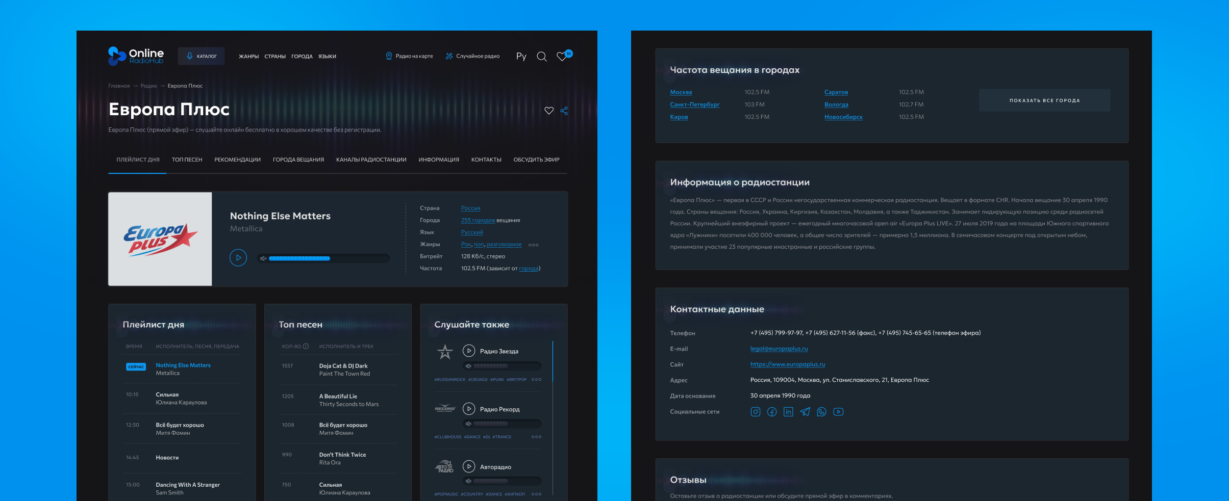
All station info, tabbed and accessible
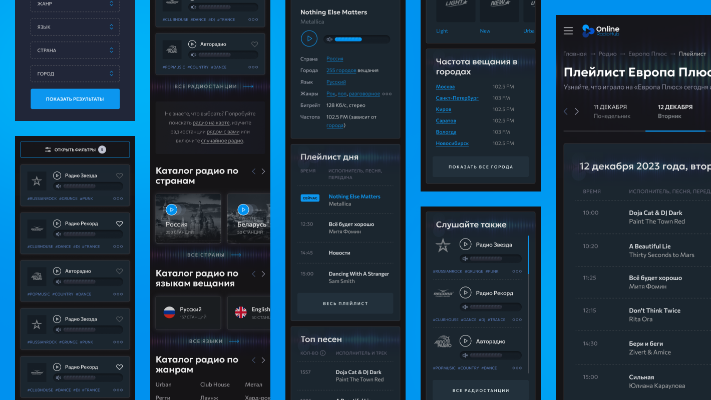
Playlist, top songs, recommendations, and full station info — organized into tabs so users find what they need without scrolling through everything.
Player with volume control
A user-adjustable volume slider was added as a first-class control on the station page (one of the most-requested missing features in the original version).
"Also listen" recommendations
Related stations appear directly on the station page, giving users a natural next step and keeping them inside the platform instead of going back to search.
Online Radio Hub
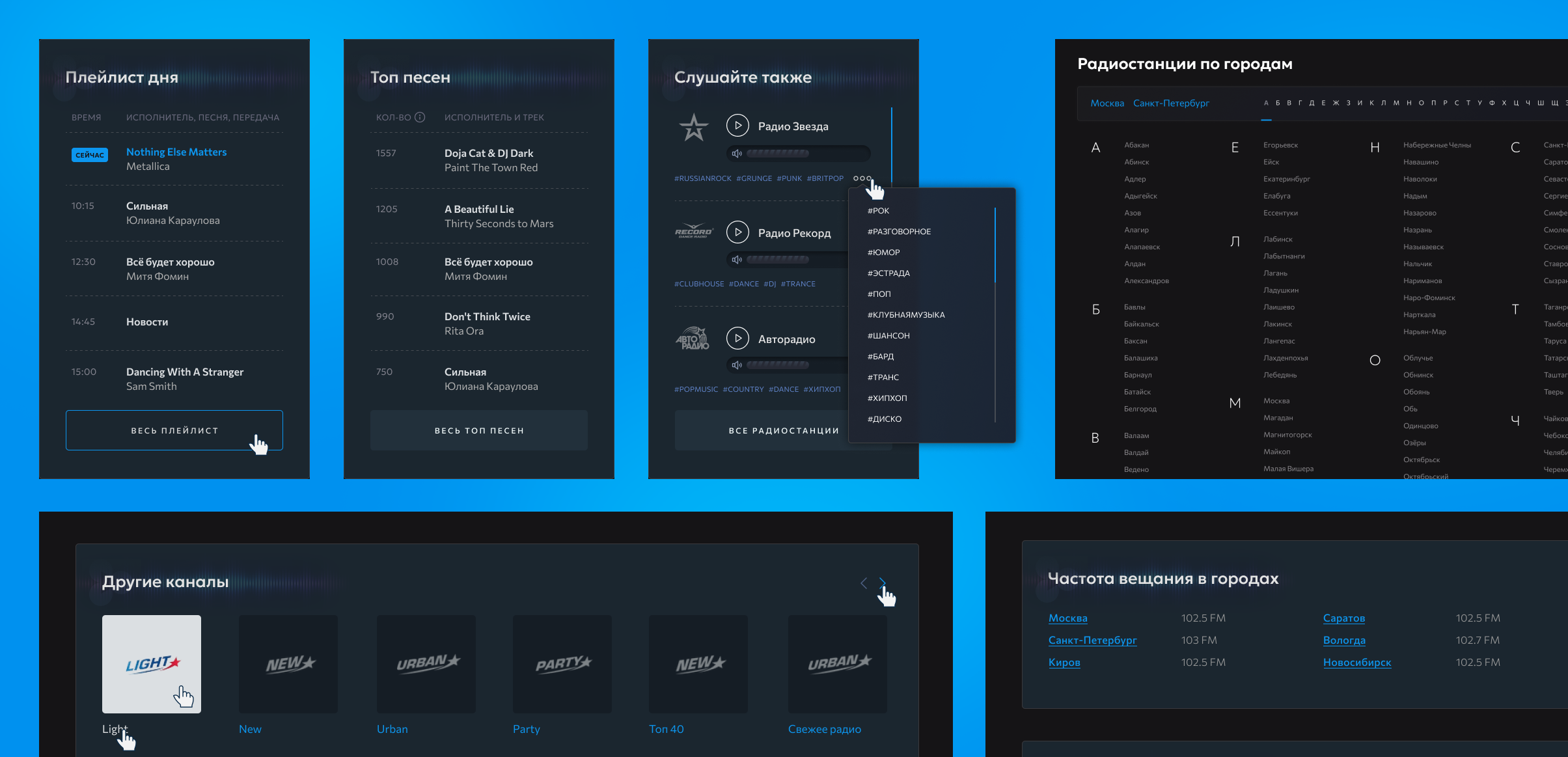
Daily playlist
A dedicated playlist-of-the-day view gives users a time-stamped track history for each station. A feature that drives repeat visits and session depth.
Top songs chart
The most-played tracks are ranked and displayed per station, giving users a quick read on a station's character before they start listening.
Track history
Every playlist entry shows exact broadcast time, making it easy to find a song heard earlier and identify patterns in the station's programming.
Online Radio Hub
Radio without borders
An interactive world map turns the entire planet into a browsable catalog. Click any country or city and start listening to local stations instantly.
Weekly playlist
Users can browse what played on any radio station for each day of the week, with exact timestamps and artist information, all in one place.
Related stations
The "Also listen" sidebar surfaces similar stations on the playlist page, so users have a natural next step without going back to the catalog.
Technical consistency
  • All design layouts are created across desktop (1440px), tablet (768px), and mobile (360px), with consistent handling of breakpoints, content reflow, and touch targets.
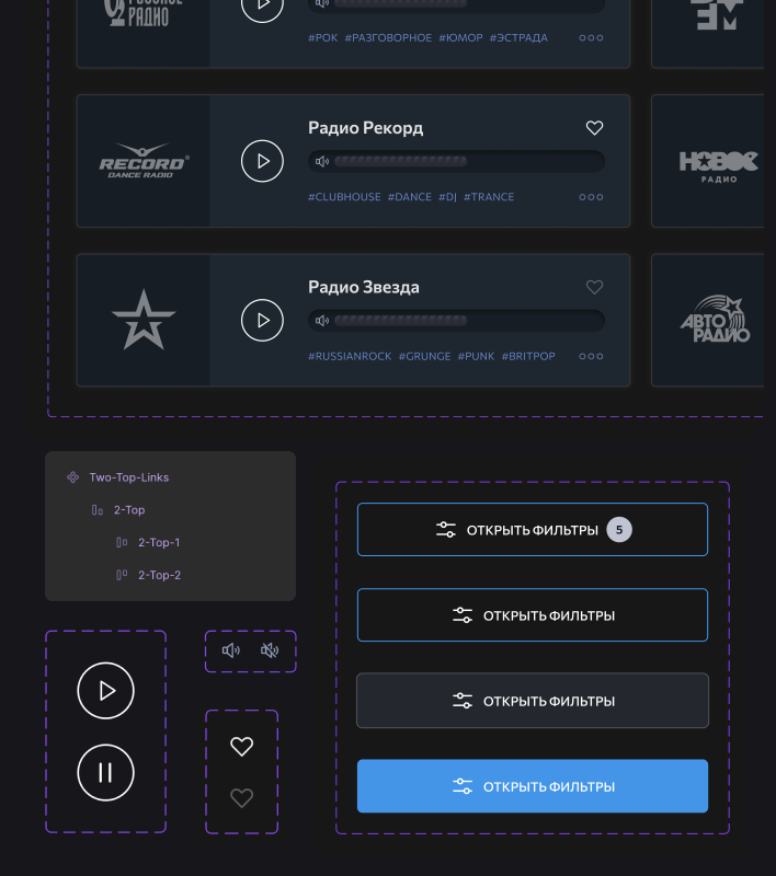
  • Active states, hover effects, empty states, and error conditions are defined and visualized across all interactive elements: filters, player controls, favorites, search, tabs, and station cards.
  • UX writing was developed as part of the design process: all interface labels, hints, empty states, and onboarding prompts were written and integrated directly into the layouts.
  • The project’s working files are structured in Figma (components, auto-layouts, variants, color and typography) and fully prepared for developer handoff.
Boris

We’ve got a really amazing result for a fair price. Alex’s experience really shows: he didn’t just “draw screens,” he consistently offered user-focused solutions. Whenever we discussed an element or a flow, he proposed options that actually improved usability and explained clearly why they worked better. Collaborating with him was genuinely enjoyable: communication was easy, he was quick to respond, and the feedback/edits process felt smooth and stress-free. We’re very happy with the outcome and can confidently recommend Alex: we’ll definitely work with him again.

Boris,
Project Manager, Owner