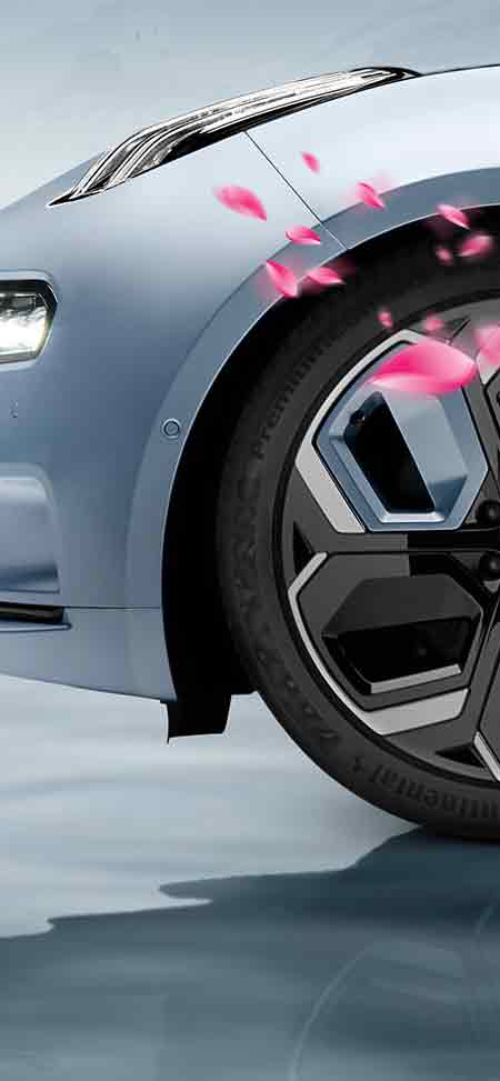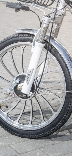

Kaikki Bikie
The responsive online-store website from Finland selling bicycles of different types and for various audiences.
Role:
concept, research, design
Tools:
Figma, PS, Miro
Duration:
1,5 months

Problem
The sector of online bicycle shops in Finland suffers from a shortage of full-fledged information about new products and simple tools for ordering bicycles to your home or office.
Goal
To develop a multifunctional information Internet resource for bicycle buyers in Finland — with a clear structure, intuitive navigation and a simple step-by-step ordering system.
Key pain points
1
Users want to get information about new bikes.
2
People are interested in relevant useful articles on bicycles.
3
Everybody needs a convenient simple bike ordering functionality.
4
Users want advanced delivery options right to their home or office.

Age
23
Education
Student
Location
Helsinki, Finland
Family
Single
Occupation
Student

Typical User Persona: Sophie
«I want to gather the coolest collection of bikes in the world!»
Sophie is a young girl from the Netherlands who lives in Helsinki and studies at the university. She is fond of cycling and everything related to it. She has a collection of bicycles, which she updates, following the novelties of bicycle products in online-stores.
Goals
- To be aware of new bikes.
- To gather a coolest collection of bikes.
- To maintain a sporty lifestyle.
Frustrations
- It’s difficult to find high-quality sources of information on bicycles.
- I want to be able to order and deliver bikes quickly.
Wireframes
In the early stages of the project, I developed a large number of different versions of paper and digital wireframes. In all of them, I tried to find the best ways to solve the problems of optimizing the structure, navigation and information content. All this is so that the user wins and gets as a result the most thoughtful service that meets all his needs.
54
paper and digital wireframes in total


Prototypes
I have prepared a set of clickable prototypes with low and high fidelity, which demonstrate how the user navigates through some pages and screens. This approach simplifies understanding on the part of the customer and stakeholders and gives a visual picture of the user's path before the mockups stage begins.

I tested clickable prototypes on a focus group of users and the information I received allowed me to draw several critical conclusions (in particular, along the way of ordering, as well as the output of informational articles). The analysis and processing of the results helped me edit the project mockups.
Usability study: findings
These are the key results of the usability study.
1
It’s necessary to implement the most effective product filtering system.
2
In the product card, some additional options, such as color and size, are needed.
3
The user needs the ability to enlarge photos of products.
4
In articles about bicycles, it’s important to give a brief announcement of the content at the beginning.
Mockups
Through communication with the target audience of the product, I gained invaluable experience that helped me look at some things from a different angle. All layouts of the project were finalized in accordance with the results of the study and the conclusions obtained. Below you can see some sample files in the final version.
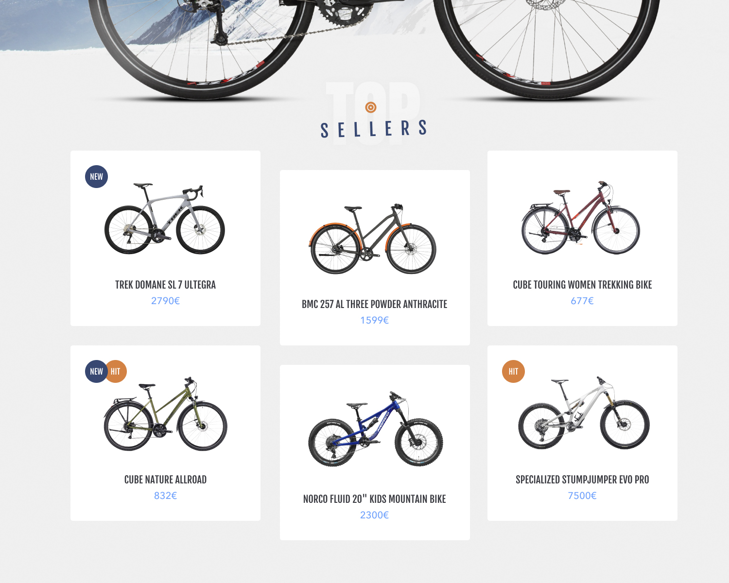
The block of the best-selling bicycles. The atypical layout of the cards gives an increased emphasis.
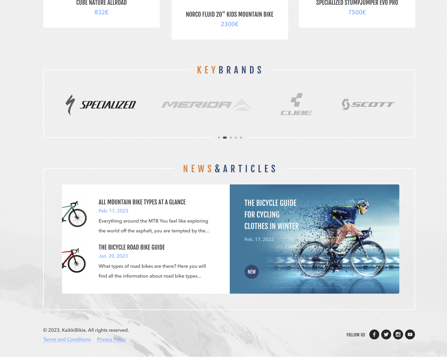
The block of articles is specially divided visually into two parts: informational and graphic.
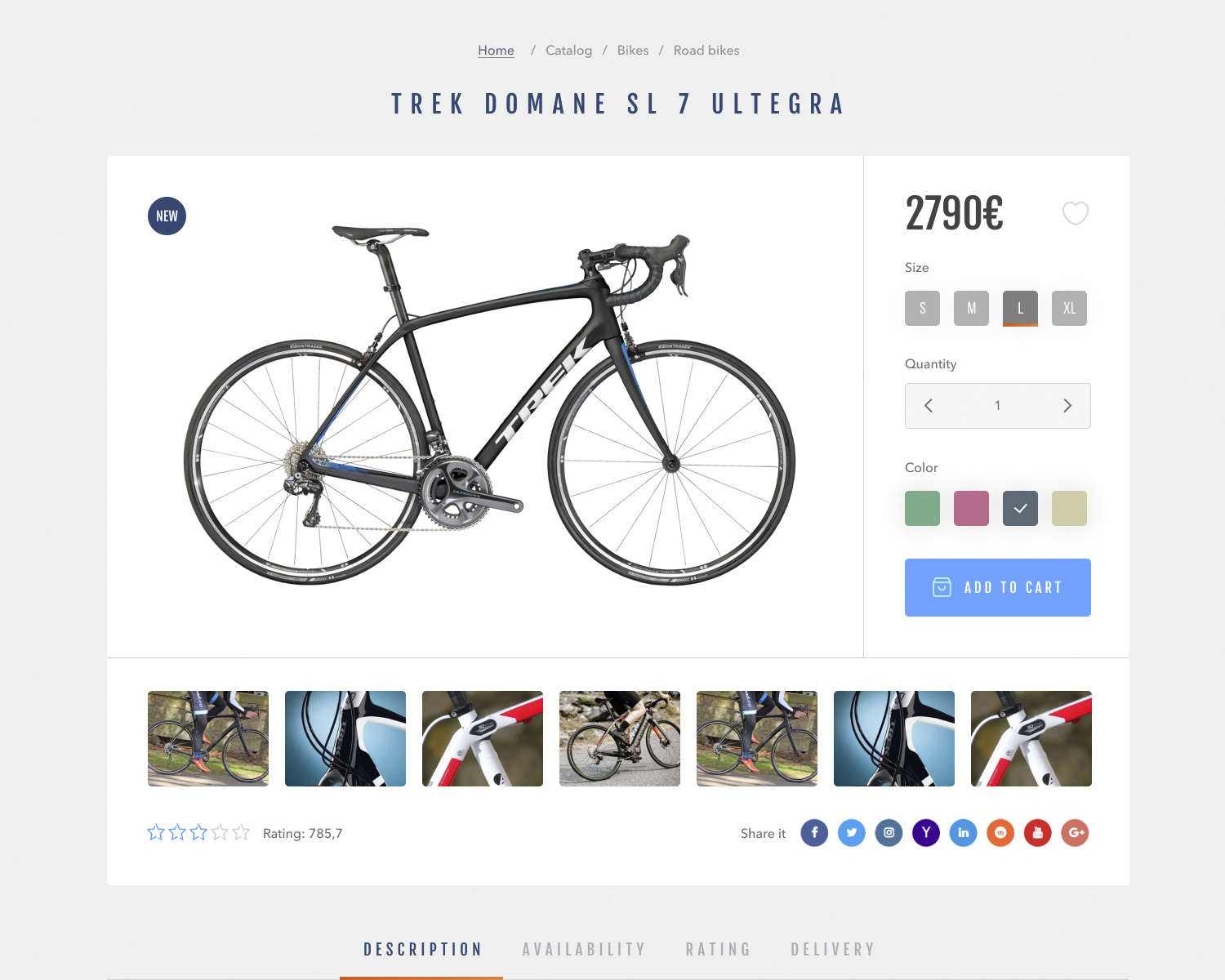
Product page. The main focus is on the product itself and its consumer characteristics.
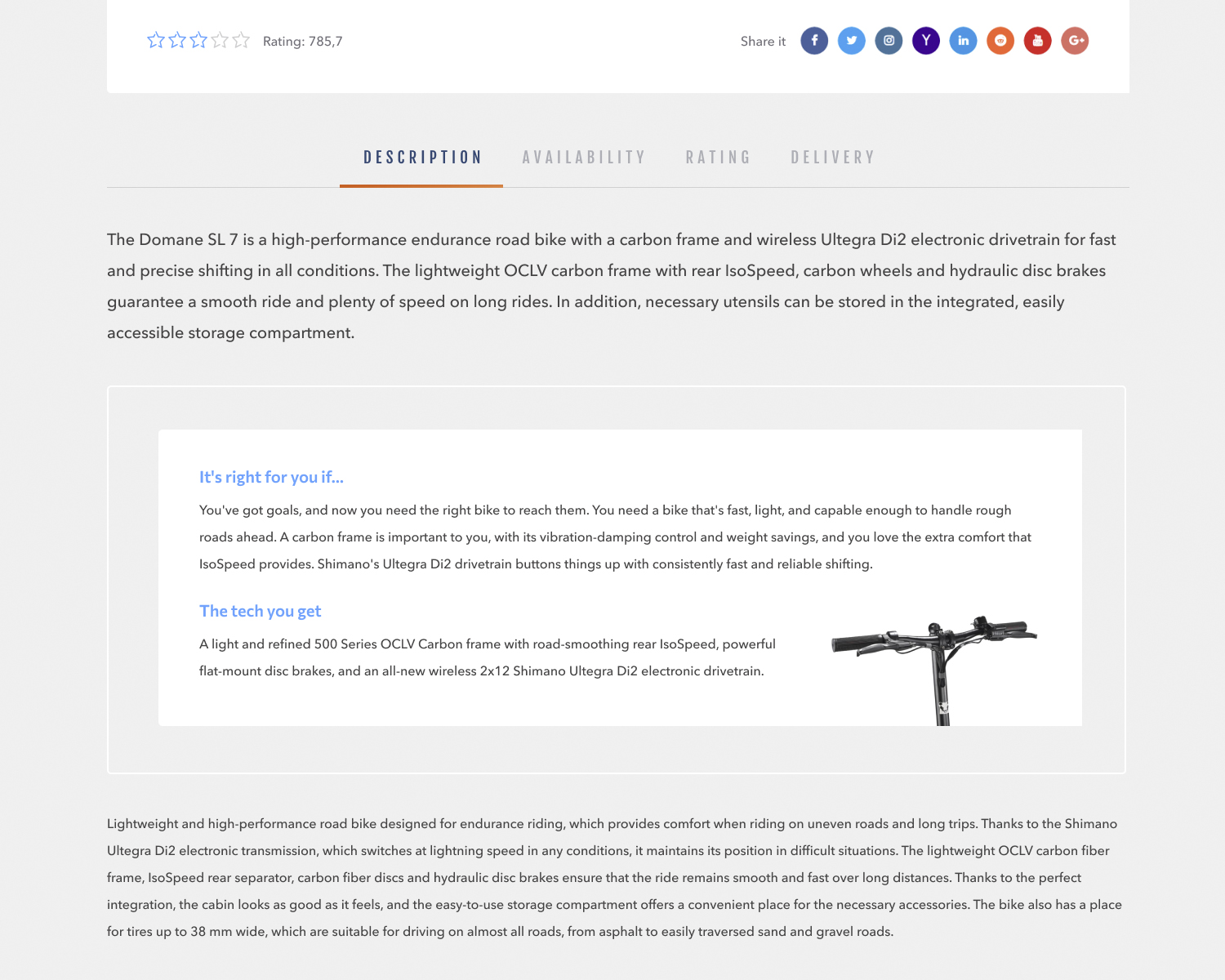
For ease of perception and navigation, I have divided a large product description into several logical parts hidden inside tabs.
Conclusions
The most important thing in a digital product is not beauty and bright colors, but ease of use and ease of understanding the essence of the service. It’s more important to give the user what he needs every time than to surprise him once with a riot of visuals, which he will remember, of course, but won’t be able to apply in any way in his ordinary life.
a Quote from user feedback
Wow, it's really great that you put a filter block here. It's just convenient.