
Shirak Avia
The responsive website for the Armenian airline, which is engaged in passenger transportation.
Role:
concept, research, design
Tools:
Figma, PS, AI
Duration:
1,5 months

Problem
At the end of 2021, the airline received a certificate for commercial passenger air transportation and in 2022 decided to significantly redesign its website, making it convenient and attractive for passengers.
Goal
I was tasked with making a modern design that is user-friendly and relevant to current market trends in the industry. One of the mandatory requirements of the customer was the use in the design of the image of fruits symbolizing Armenia — pomegranates or apricots.
Key pain points
1
Frequent changes in the flight schedule.
2
People are looking for tickets at low prices.
3
Many users can't find/understand the baggage rules.
4
People are looking for tickets without hidden fees.

Age
32
Education
Bachelor's degree
Location
Yerevan, Armenia
Family
Married
Occupation
Project manager

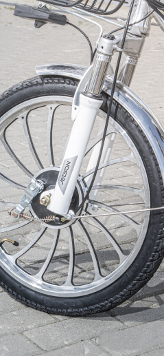
Typical User Persona: Lori
«It's important for me to know that everything is under control in my work».
Lori works as a project manager for a large trading company from Armenia. She lives in Yerevan, but often flies to Moscow on business trips. When ordering tickets, comfort, flexible prices and a customer-oriented approach are important to her.
Goals
- To be aware of new bikes.
- To gather a coolest collection of bikes.
- To maintain a sporty lifestyle.
Frustrations
- It’s difficult to find high-quality sources of information on bicycles.
- I want to be able to order and deliver bikes quickly.
Wireframes
When the project is based on user forms and features of interaction with them, this implies a more thorough study of all the nuances. Having the results of competitive audit and interviews conducted, I put forward a series of various concepts on the structure and functionality of the interface.
74
paper and digital wireframes in total


Prototypes
When I started testing my hypotheses on clickable prototypes, I had to go back a few steps and make a number of significant edits to my original concepts. We interacted with the customer's representative and together we managed to get exactly the conclusions that allowed me to bring the layout to its final state.

Thanks to the results of testing clickable prototypes, about 55% of the original versions of the user forms have been processed and improved.
Usability study: findings
These are the key results of the usability study.
1
The ticket search form should be exceptionally simple and concise.
2
Illustrating the functionality with thematic icons improves perception.
3
The link to the fare rules is optimally placed within the ticket search form.
4
The information is primary, the visual is secondary (this applies to the strict business style of the airline's website).
Mockups
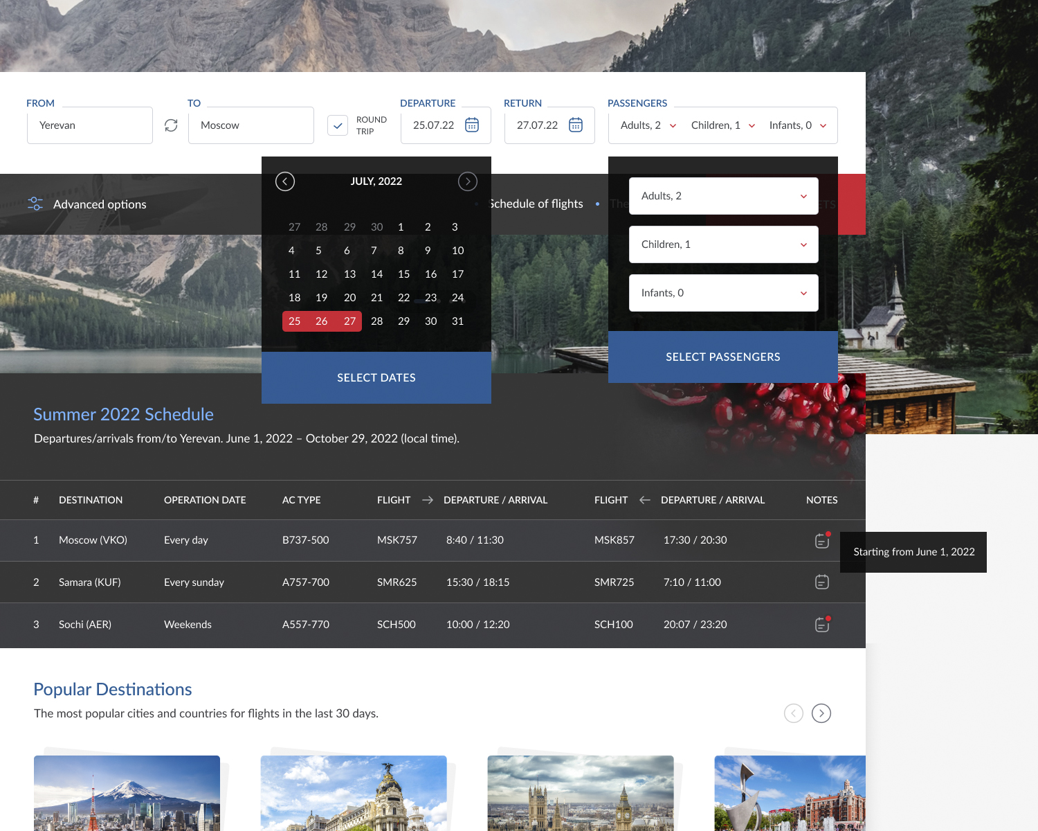
Thanks to communication with the target audience of the product, I gained the most important experience, which helped me to look at some ideas differently. All layouts of the project were finalized in accordance with the results of the study and the conclusions obtained. The customer's wishes about fruits from Armenia were also fulfilled: I used a light background with pomegranates in the block with the flight schedule.
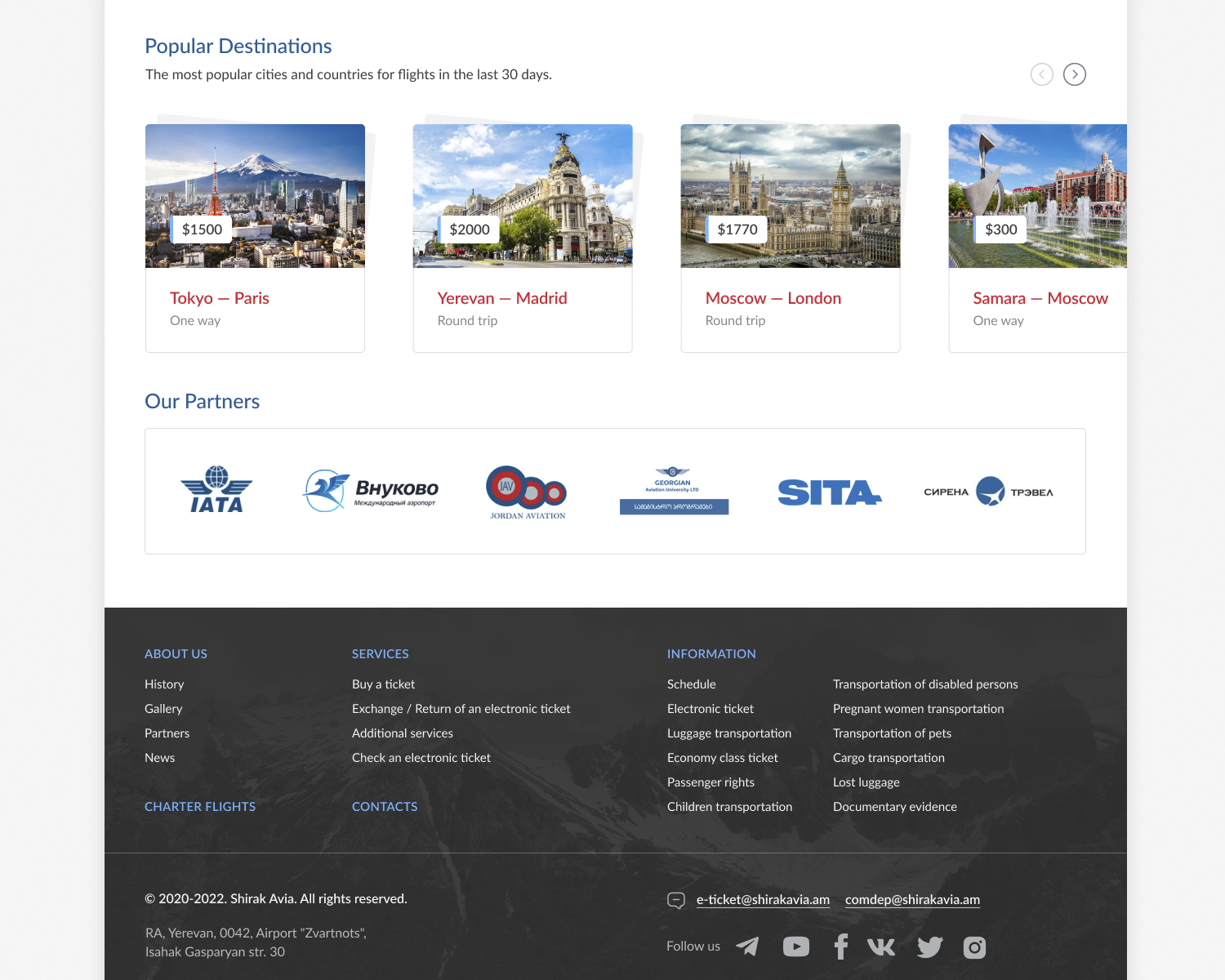
The main page (fragment): popular destinations and partners block.
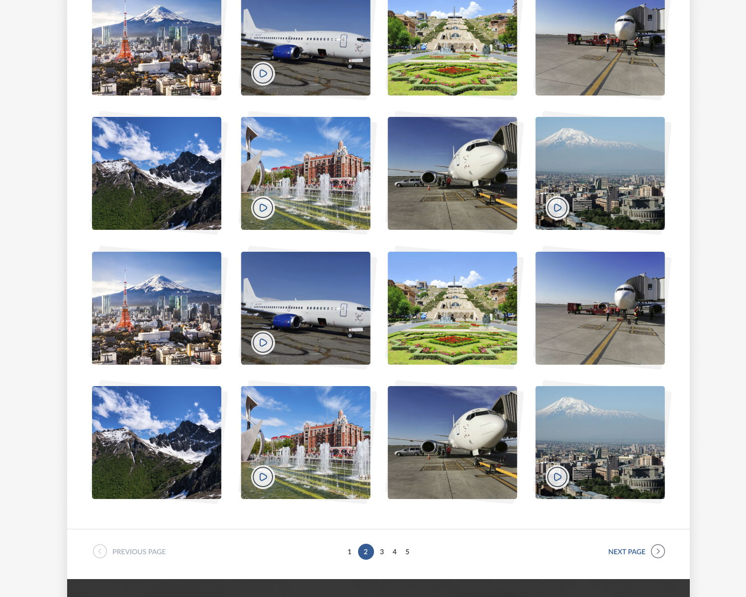
The gallery page (fragment).
Drop-down menu.
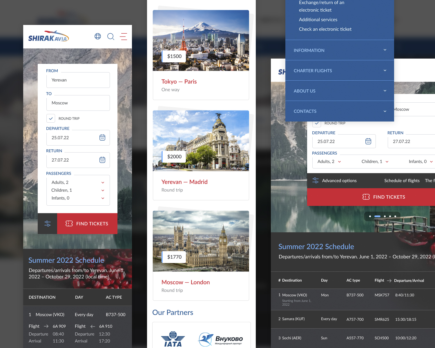
Layouts for tablets/phones (fragments).
Conclusions
An interesting thing. I use various forms of search almost daily (including tickets). When you do this as a user, it happens automatically and you don't think about what hidden efforts are behind all these kinds of inputs, checkboxes and buttons. Working as a UX-designer, many things are perceived differently and you get an amazing experience.
a Quote from user feedback
Intuitive and accessible — that's what a ticket search site should be.